Earn the Moodboard: The GovSkills Rebrand
THE FOUNDATION
Why we started with values, not visuals
The first thing everyone wants to do at the start of a rebrand is open Pinterest and go feral with references. And honestly? We almost did. But moodboards answer the question “what do we like?” and that’s not the same as “what do we believe?” We needed to establish core values first.
GovSkills sits at an important intersection of bringing together qualified candidates and the government agencies that need them. As a platform, we help job seekers and hiring managers find a common language so each can understand which roles and candidates are the right fit. That is not a simple task.
Government work is purposeful, impactful, and often invisible to the people it supports. The platform needed an identity that honored that weight without becoming bureaucratic, cold, or inaccessible.
Before a single reference was pinned, we ran a brand values exercise in FigJam with the team. The goal was to find the foundation the visual identity would have to carry.
"A brand is not just about visuals. It's the promise you make every time someone encounters your organization."
[ Photo of our figjam possibly ]
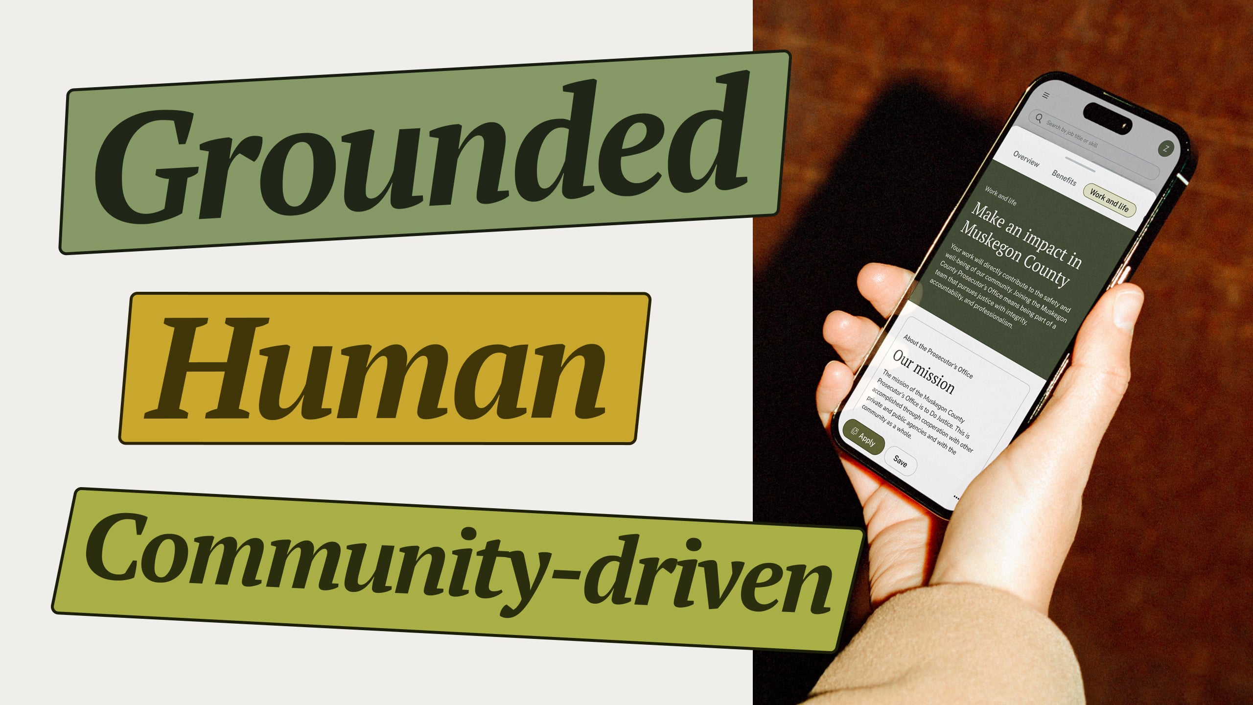
Three core values emerged from that process and they shaped every single design decision that followed:
Grounded - We believe in work that supports both people and the communities they serve. Public service is more than employment; it creates purposeful, impactful work.
Human - Job searching is hard. It is vulnerable, exhausting, and often overwhelming, especially when navigating the current complexity of government hiring. We need to focus on the human experience behind every interaction.
Community-driven - Government work exists to serve communities, and so does GovSkills. Every feature and every resource stems from listening to real needs. We are not building for users. We are building with them.
THE EXPLORATION
Exploring directions to find the right voice
With our values locked in, we started exploring concepts. The rule was simple. Every direction had to be tested against our three values, not personal taste.
There’s a moment in every project when references stop feeling like research and start feeling like a direction. For us, that moment was mid-century civic design.
Think Massimo Vignelli’s NYC subway system. Vintage National Park Service pamphlets, maps, trail routes, safety signage, some of the most underrated information design ever made (and now highly collectible). None of it was trying to be pretty. It was trying to be useful, and in the end, aged better than almost anything.
"Mid-century civic design was built to communicate clearly to everyone, including people who were stressed, in a hurry, or unfamiliar with the system they were navigating. That's exactly what GovSkills needs to do."
That influence even made its way into our color names. “Eames” isn’t just a nod to Charles and Ray Eames, it’s a direct pull from their world. That yellow-green showed up everywhere: avocado upholstery, fiberglass Herman Miller chairs, graphic systems of the era. It feels rooted and optimistic at the same time, the same feeling that defined mid-century public service design at its best.
THE DESIGN SYSTEM
Every decision has a reason
A great design system shouldn't call attention to itself. It should evolve quietly and respond naturally to the problem space.
Job hunting is stressful under any circumstance, and government hiring adds layers that can feel overwhelming. When someone is searching for a job, they are often anxious, time pressured, or making a meaningful decision about their future. The design should not add to that weight, but rather reduce it.
[ Photos of our branding throughout ]
That's why the spacing is generous, not for aesthetics, but to lower cognitive load. The breathing room gives information space to land before the next piece arrives.
That's why we chose Public Sans for body copy: it was literally built by the U.S. Web Design System for government digital services, optimized for legibility across screens, ages, and reading abilities. And PT Serif for headlines — originally designed for public use and maximum legibility, with a weight that feels civic and authoritative without veering into corporate.
The color system carries the same philosophy. What makes it actually work at scale is the tonal palette we built underneath each one.
Our brand colors (Olive, Eames, Gold, and Stone) have twelve steps, running from near-white all the way to a near-black. The lightest tones handle the quiet moments: backgrounds, subtle hierarchy, a little breathing room. The middle range does the heavy lifting across the interface. The darkest values anchor things when you need real weight and contrast. This creates flexibility and helps meet WCAG accessibility standards.
Nothing in our design is arbitrary. Everything was done with intent.
REFLECTION
What this rebrand actually means
Here’s the thing about doing the foundational work properly: it makes everything else faster.
The FigJam session, the values conversations, and the deep dive into mid-century civic design history was the design work. The rest was execution. And honestly, that’s how it should be.
Vignelli spent months studying how people actually moved through subway stations before he sketched a single line of that map. The research wasn't a warm-up, it was the work.
"A rebrand is an alignment exercise. You’re not changing who you are, you’re making sure how you look matches what you believe. "
The moodboards were waiting for us the whole time. We just needed to earn them first. Because once the foundation is clear, the visuals almost design themselves.